Adventures in Hand Lettering
/I loooooove hand lettering. I'm obsessed with how messy and flawed and carefully crafted it looks.
I think I've been obsessed with hand lettering since before I realized it, back when I used to inhale as many Baby-Sitters Club books as I could. And what did they have every time there was a super special combined book that featured every BSC member getting their own chapter? A sample of their hand-writing!

Although I was a preteen and therefore kind of stuck in Stacey hand writing mode for a while - upright curvy letters and circles dotting the i's - I slowly gravitated toward Dawn's more tilted, casual script. Eventually it evolved into the messy, unattractive handwriting I still hold onto today, crafted by years of taking notes in college and work meetings. Speed became way more important than how it looked. I've never been a fan of my own handwriting, but lately I've gotten sick of how much it's devolved and have been consciously trying to spruce it up.
And what better excuse for testing out some handwriting skills? Wedding invitations, of course!
When we first started planning the wedding, I knew invitation design was one of the few things I'd really get into (not terrified by, such as catering and venue holding and money spending). The invitations themselves were cobbled together in a collection of handwriting-like fonts (I'll post those post-wedding -- actually there's a BUNCH of stuff about the wedding I will be posting once it's all over and I can get back to breezy, casual reality!) because I was too chicken to try my pen at them, but I decided to just go for the gusto with the envelopes.

That's right, no pencilling beforehand, straight up ink! I wanted some way of combining the big and the swoopy with the thin and straight - so I decided on swoopy for the people, and organized for the address. However, it wasn't long before I abandoned doing the address part and outsourced that to my fiancee - he was much more concerned with being neat than I was, and it was way more fun to make it a team event.
I was quite pleased with the messy result, and it was so much fun I decided to extend it to the table decor as well. I knew I wanted each table to hold a drawing of one of our interests. At first I envisioned (as I usually do when starting a project) that the drawings would be very neat, precise, and I would draw with very thin, detailed, simple lines using only a tiny Micron pen. Of course that didn't happen, because like most things I do I end up working larger and messier than I plan and things take on a loud, weird life of their own.

So I abandoned tiny neatness and went for mimicking the swoops of the envelope handwriting. This time I used a brush pen for the swoopy, which defeated the purpose of the thin spidery lines I like, but was fun nonetheless.
Here are how some of my favorite ones turned out:
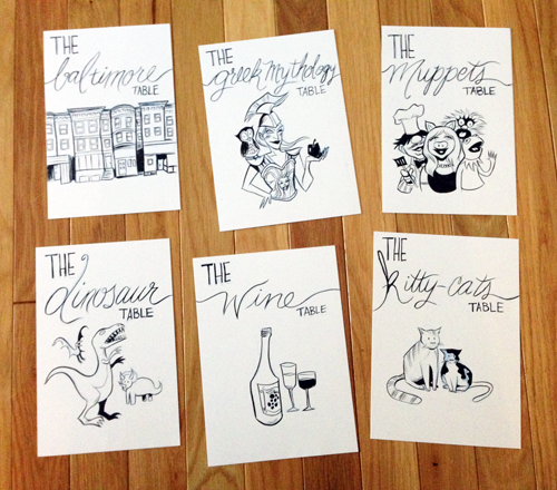
Now, I anticipate EVERYONE will want to sit at the Muppets table and I'll be the sole nerd at the Greek Mythology table . . .
